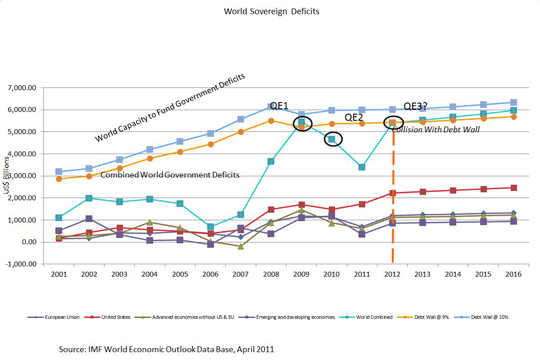
There is a limited amount of money that the world’s sovereign governments can borrow in any single given year without pressuring interest rates to rise above the point of affordability. This limit is approximately 9% of the world’s gross domestic product (GDP). The following graph chart demonstrates this concept.
The world’s GDP has been hovering around $60 trillion for the past three years. The orange line on the chart is 9% of recorded world GDP. The blue line is 10% of world GDP. The teal line is the combined collective deficits of all world governments. The red line is the individual sovereign deficits of the United States. The purple line is emerging and developing economies which includes non-G7 and non-G20 economies. The dark blue indigo line is the European Union. And the olive green line is advanced economies without the U.S. and Europe. This would be the G20 countries’ economies.
Again, the teal line is the combination of the red, purple, indigo and olive individual country economy totals. Prior to 2008, combined world government deficits were well below 9%. In response to the 2008 worldwide economic meltdown, governments made one-time extraordinary expenditures to keep the world’s economy afloat. This included TARP, Stimulus, bank and corporate bailouts, and ongoing structural deficits. This number peaked, as one would expect, in 2009. 2010 was an extension of those extraordinary expenditures. The definition of a Debt Wall is the point at which total world government deficit spending exceeds 9%, and thereby forces interest rates to rise above the point of affordability for sovereign government borrowing. The simple formula to know when one has reached the Debt Wall is:
World Gross Domestic Product x Y(9%) – combined world government deficits = 0 or less
Applying this formula to 2009 world spending illustrates why the United States Federal Reserve implemented QE1. Their purported reason was to keep interest rates down, and that’s exactly what they did. As the Debt Wall Index approached zero, it was necessary to print money rather than borrow it. QE2 was an extension of QE1 and part of the same process. What is alarming now is that the projections of world government deficit spending for 2012 again approaches the ceiling of world liquidity and the Debt Wall. The only difference is that now, deficit spending is not extraordinary, it is structural. This means that it goes on forever unless the economy grows faster than the percent of deficit spending to the overall GDP. Given the fact that total government and world debt is approaching 100% of GDP, the world cannot afford higher interest rates, even for a short period of time.
The projected GDP of the world in 2012 is approximately $60.25 trillion. The amount of cash available to fund government deficit spending on a world basis is approximately $5.4 trillion. As the world’s governments continue to borrow and spend, we are on a collision course with the Debt Wall. The Debt Wall Index is a countdown to this collision. If the economy grows faster than we have projected, the Debt Wall Index will be adjusted to reflect that. On current projections of economic growth and government spending, the Debt Wall will be hit by July 31, 2012.

First published: http://debtwall.org/world-sovereign-deficits-analysis-chart/